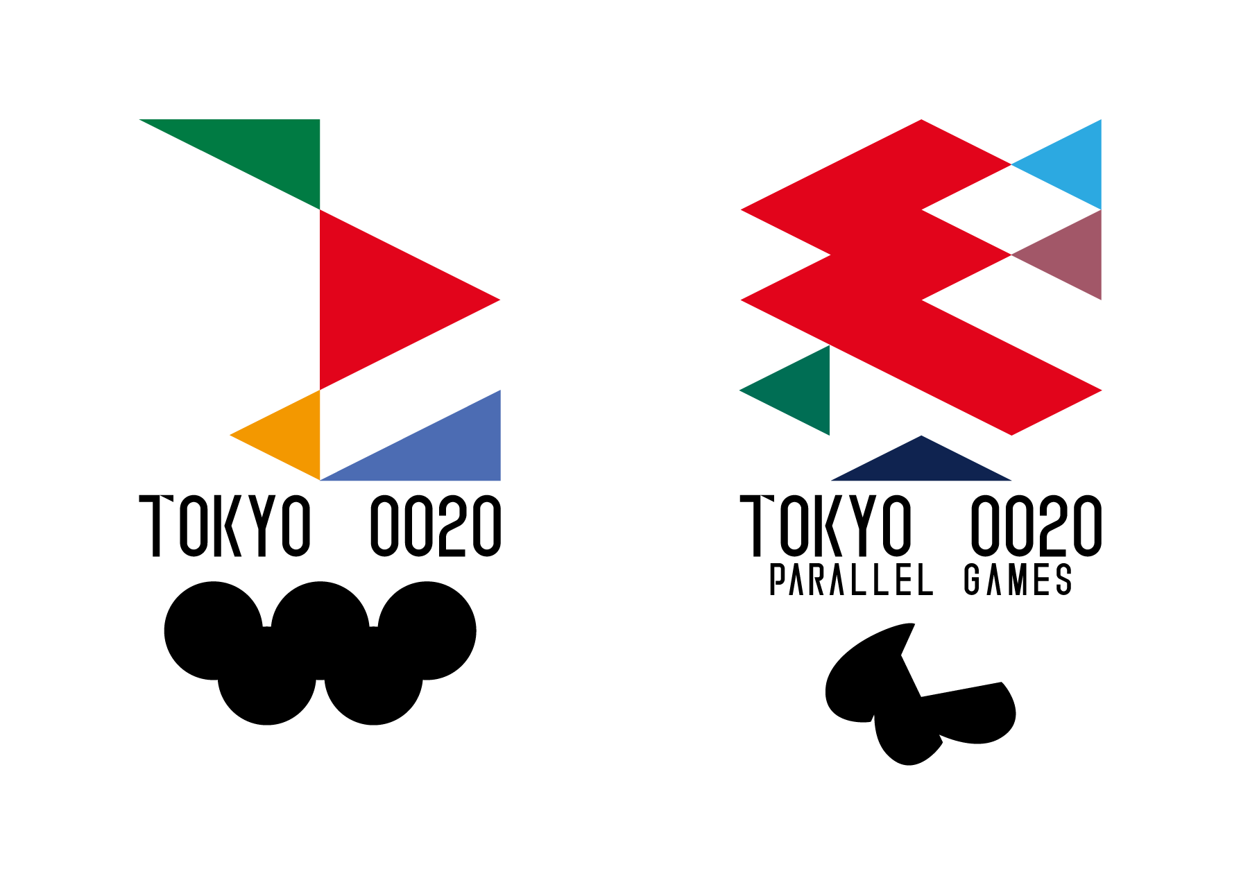
The Gorin-hitoe
Notice:In order to avoid a trademark, it was replaced a part of the structure.
Supplemental:We applied in a different title at the time of application, but we have renamed. It is to highlight and individuality of as work.
OΓZKΛWΛ(Presently OZKAWA Ipalo)'s applicants reason is here.
This emblem, inspired design from the Kanji. Because I wanted to make you feel in the simple design of the Japan-ness.
In addition, it designed the Japanese tradition in the "diamond" reminiscent. As a result, such as the alphabet and objects in the eye of the beholder, the appearance is diverse. This is to express the fact that each human individual has a personality. It is as a result, has the image of a participation to people all of the personality.
>Olympic
Japan has been referred to as "Yamato(大和)" since ancient times. It has also been used, for example, when representing the Japanese mind and Japanese itself. Its history is too long, dating back to the Nara period. The word "Yamato" will not always be an exaggeration to say that walked the history along with the Japanese people.
That based on the character of "Wa(和)" from the word "Yamato", it was designed by using the square and straight. Most of the emblem is the motif of the left half of the "Wa". How it was expressed in the right half? The right half was represented in the lower right of the triangle. In addition, right-angled triangle in the upper-left corner of the emblem is an image of the terrain of the Tokyo Metropolitan Government. This is to express that this Olympic Games will be held in Tokyo.
>Paralympic
Paralympic Games, a lot of people with disabilities athlete challenge in a variety of competitions. Is it, would our not is of a world beyond the imagination? As a result, it might leave a huge impact on our "mind".
Paralympic emblem, the character of this "mind = heart(心)", was arranged in symbolic by using a diamond and triangle.
Triangle at the bottom of the emblem is the image of a foundation. It expresses the world each other sincerely support the human race.
>Logotype
This tournament is a tournament leading to the past and the present, and future. I think so, I was referring to the Tokyo Conference of the emblem in 1964. As a result, it was this word mark design.The T of the character as a "T '", was arranged as with a dash. Thereby, this tournament is like a pin, was the hope that I want you to be those that remain in the hearts of many people.
>Coloring
All of the colors that are used in the top emblem, the traditional colors of Japan.
- >Olympic
- #007B43
- Tokiwa-iro 常盤色→The symbol color of Tokyo metropolitan gov.
- #E2041B
- Shōjō-hi 猩々緋→The passion shining in the Japanese people's mind
- #F39800
- Kin-cha 金茶→"Gold", used in Japanese traditional crafts such as Makié and Urushi
- #4C6CB3
- Gunjō-iro 群青色→Beautiful blue sky of Japan
- >Paralympic
- #2CA9E1
- Ama-iro 天色→Paralympics deserve beautiful sky
- #A25768
- Asa-suou 浅蘇芳→Full of joy of the human mind "kindness"
- #E2041B
- Shōjō-hi 猩々緋→Same to Olympic's Shōjō-hi
- #006E54
- Moégi-iro 萌葱色→The "Omotenashi" without discrimination towards the people all over the world
- #0F2350
- Koi-ai 濃藍→"Blue close to the black" in harmony with any color